Tring Studio
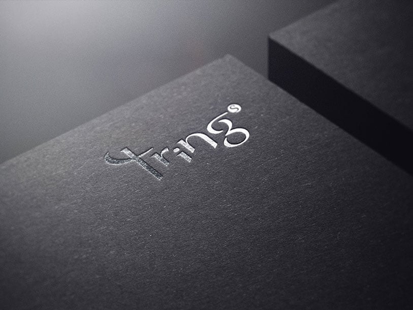
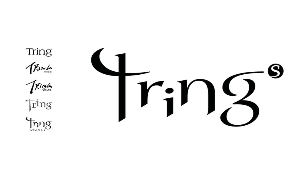
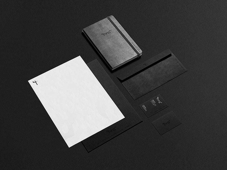
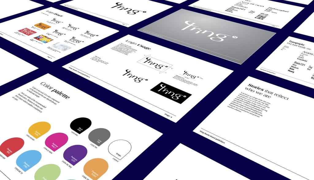
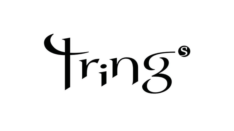
This project focuses on developing the brand identity for Tring Studio, a company whose name evokes the sound of drawing a sword, symbolizing a group of armed fighters ready for battle in the business world. With a warrior concept at its core, the brand identity features a sharp and agile typeface that conveys strength and readiness. After several rounds of revisions, the final design encapsulates this essence effectively. Although the full name of the company is Tring Studio, the client desired a simpler representation, leading to the incorporation of a dot with the "S" to signify the word "studio" and suggest the plural "Trings," reflecting multiple instances of drawing the sword. Additionally, the project includes a comprehensive brand guideline to ensure consistent logo application across various platforms, reinforcing TRING's identity as a formidable force in its industry.
