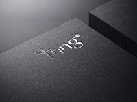
Client: Tring Studio
Type of Business: Design Agent
Project: Logo, Stationery, and Design Guideline

TRING, a sound of drawing a sword, to present themselves as an armed fighter and ready for the battle in the business world, which is the meaning behind this company - Tring Studio. According to the message this company wanted to communicate to its client, I have used many sharp edges in the logo. The letter T is represented as a sword, and the letter S at the end is the first letter of Studio, which shows in a stamp form


© 2021 Copyright - Louis Li


